Autumn Palette; The Color Map of an Ancient City
A Practical Guide to Give Your Paintings the Scent of Memory, Not Fresh Paint
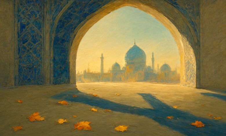
Imagine Chaharbagh Street in Isfahan in early November. The sun no longer carries that scorching heat of Abbasabad’s summer. Light falls obliquely on the tiles of Sheikh Lotfollah Mosque, turning the dome’s turquoise into an amber yellow. This is precisely the moment a painter opens their paintbox.
I have been painting ancient landscapes for years. At first, like any beginner, I reached for bright, cheerful colors. The result? Paintings that were “beautiful” but lacked “feeling.” An Isfahani painter-potter once told me: “You must extract the color of an ancient city from the heart of the city itself, not from the paintbox.” He was right. In Safavid architecture, with the formation of the Isfahan School, colors were no longer mere decoration; they became the city’s identity. The blue of Imam Mosque, the yellow of the bazaar’s baked bricks, the green of Naqsh-e Jahan Square’s domes, and the warm ochre of Jolfa’s alleys.
Academic research in the field of “urban color landscape” states that the color palette of a historical fabric is not accidental, but rather the result of an “inherent color system of native materials in harmony with climatic conditions.” This means these colors were made for this climate. So if you want to paint Isfahan in autumn, you should not go for the bright orange of the trees on Tehran’s Valiasr Street. You should go for the turquoise of a dome that autumn sunlight has turned into amber.
My autumn palette was born from these very observations. I start with a base of warm ochre; the color that flows through the heart of Isfahan’s ancient bricks. Then, I add burnt turquoise; not the cold blue of summer, but a blue upon which a thin layer of autumn dust has settled. For depth, I use night-struck lapis lazuli; the same color found in the chiaroscuro of Chaharbagh’s evenings. And finally, a stippling of amber gold to reflect light onto the mosaic tiles.
The result is a completely linear and logical color composition: from daylight (ochre) to sunset (burnt turquoise) and night (lapis lazuli). This is the precise narrative of an autumn evening in a historical city. Not a vague feeling, but an objective visual datum. How to use it in painting? Simple: cover your landscape with ochre. Deepen the shadows with lapis lazuli. Illuminate the light points with amber. And wherever you need breathing room, bring in burnt turquoise. These four colors alone define the entire narrative of an autumn evening.
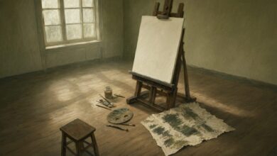
Now, my bitter confession: last month, I painted Naqsh-e Jahan Square in autumn. I followed all the principles. But at one point, my hand trembled and I used cadmium yellow instead of amber. The result? A Naqsh-e Jahan Square that looked more like a Turkish postcard than half the world. That painting still sits in the corner of my studio; a reminder that even an obsessive painter might, for a moment, forget the rules.